

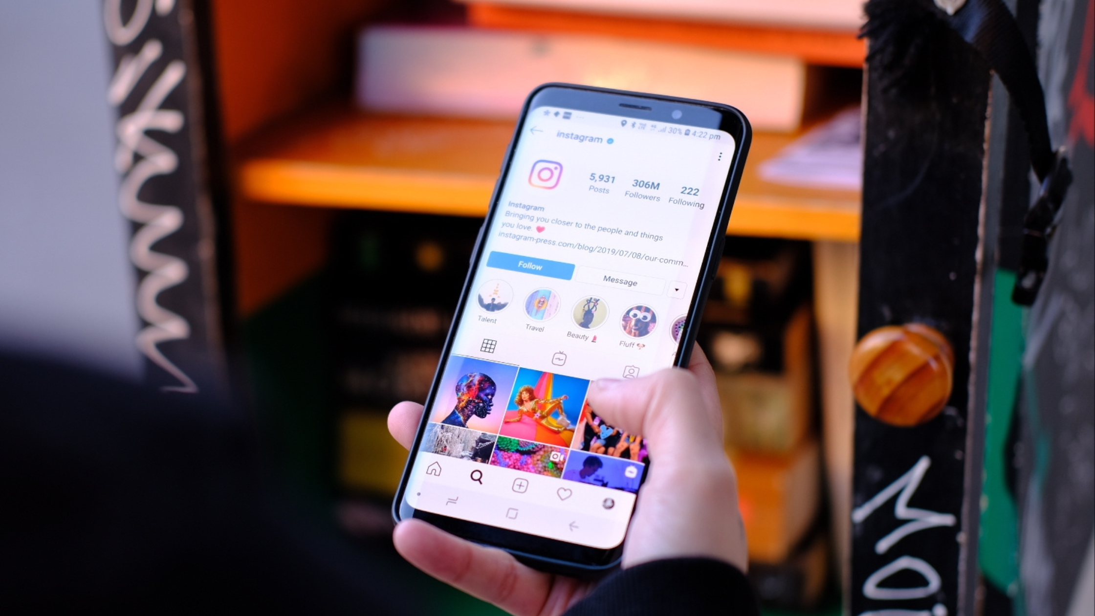
It’s no surprise that our phones are a massive part of our lives, but did you know they are transforming how we travel? Travelers are increasingly booking getaways on their mobile devices. As a result, tourism websites optimized for mobile not only generate more bookings, but they also rank higher on Google.
At Forge Apollo, our experienced travel website designers in Chester County, PA, understand how an improved website can transform sales and increase bookings.
Ready to increase bookings on your travel website? Keep reading to learn the importance of mobile website design and six easy design tips.
Why Does Mobile Website Design Matter?
More and More Travelers Plan Trips on Mobile Devices
When it comes to travel planning, convenience is key. This could explain why, in 2024, mobile users generated 70.5% of online traffic in the travel and hospitality industry.
Users appreciate the convenience and simplicity of scheduling trips on their phones. Mobile devices allow busy people to schedule stays quickly and efficiently. In today’s instant digital world, a mobile-incompatible tourism website design is not an option.
SEO Optimization
Did you know that Google indexes based on the mobile version of your website? In straightforward terms, “indexing” is the process search engines use to analyze the content on your website. Google adds your content to a database called an “index.” When a user searches for information, the “index” is where search engines pull results from.
Starting in 2020, Google has primarily used the mobile versions of websites for indexing. This means that when the crawling bot evaluates your site for search rankings, it does so as if viewing it on a mobile device.
To optimize SEO, your site’s mobile version must be well-structured, fast, and reliable.
Increase Profits
A great mobile website encourages users to book directly on your site rather than through third-party booking engines. Direct bookings are not only convenient for customers, they also increase your business’s profit margin.
Third-party booking engines like Expedia tend to charge a 15-30% commission on every booking. The bottom line is that getting more direct bookings benefits your business.
6 Tips for Mobile Travel Website Design
1. Use a Responsive Website Design
To attract the most bookings, make things easy on your visitors. A responsive hotel website design adapts your website’s layout and content to different devices and screen sizes. This eliminates separate versions of the same page for mobile and desktop users.
A responsive website can decrease bounce rates and improve user experience. No more awkwardly zooming in and out on content. Create a seamless experience for your visitors, no matter what device they use.
We developed ICONA Resorts’ website to automatically adapt its design based on screen size. For example, you can see how the design elements shift between mobile and desktop sizes.


2. Create Content for Mobile-First
As previously established, Google uses the mobile version of websites for search rankings. An easy way to ensure your content is mobile-friendly is to envision how it will appear on mobile devices before creating it. When writing copy and choosing images, spend extra time thinking about mobile layout.
Break up written content with plenty of headings to increase readability. You can also appeal to smartphone users by including bullet points and keeping information short and digestible.
3. Simplify Navigations and Forms
Don’t make customers struggle to book your travel destination. Your website’s buttons and menus should be visible and touch-friendly. 38% of users won’t even engage with your website if its layout is unattractive and difficult to navigate.
Additionally, ensure users can easily complete all forms on a mobile device. Efforts are pointless if a guest can’t complete a booking.
ICONA Resorts clearly has all navigation and buttons at the top of their website. The “Book Now” button is also visible and easy to click on mobile.


4. Optimize Site Speed
Your users expect speed, so fast website loading times are a necessity. Nearly 70% of consumers say that page speed impacts their willingness to purchase. Efficient sites keep visitors engaged and can cause them to think highly of your brand. These factors contribute to more bookings.
PageSpeed Insights is a helpful tool that allows you to check your website’s speed on mobile and desktop.
5. Streamline the Experience
Simple design layouts benefit smaller screens. On mobile devices, hide non-essential design elements to avoid overcrowding. Cluttered screens can confuse and overwhelm customers.
6. Continuous Testing
Sometimes, the most effective way to evaluate your mobile site is to check it yourself. Use devices of different sizes and use different browsers to inspect your site. Put yourself in the traveler’s shoes! Would you be satisfied with the experience? If not, continue troubleshooting and making improvements.
Trust Forge Apollo with Website Design in Philadelphia
Your tourism website design should excite travelers about their next destination! Contact Forge Apollo today to generate more bookings. Whether you want to optimize site speed or simplify mobile navigation, our hotel website design company and marketing agency can help.